Primary Bath Remodel: The Grand Redesign
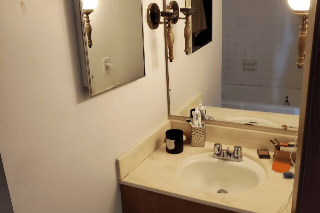
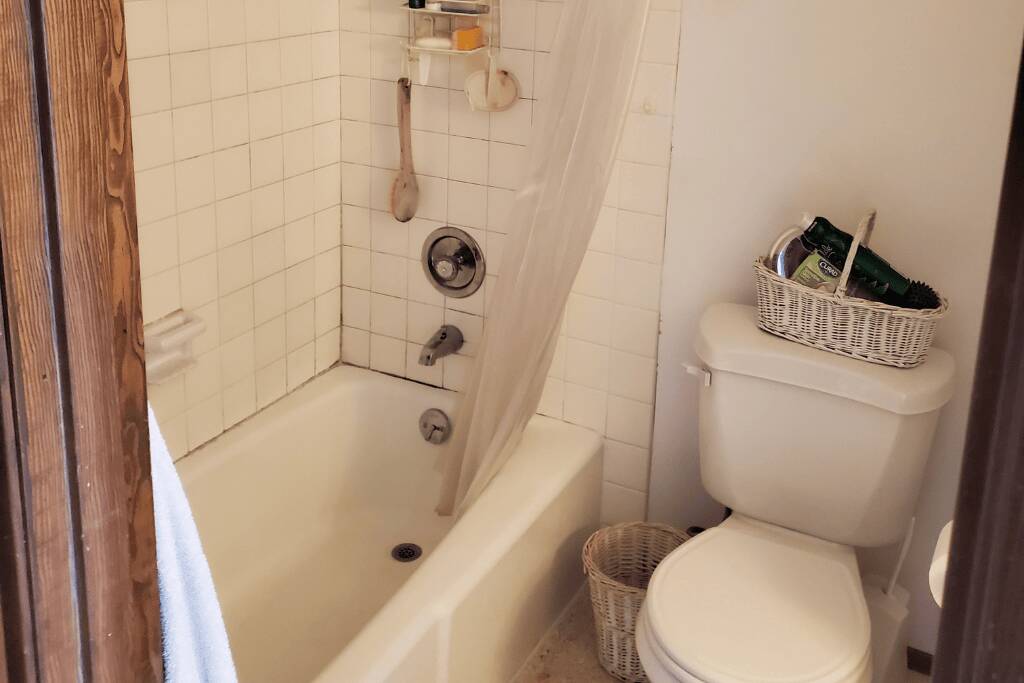
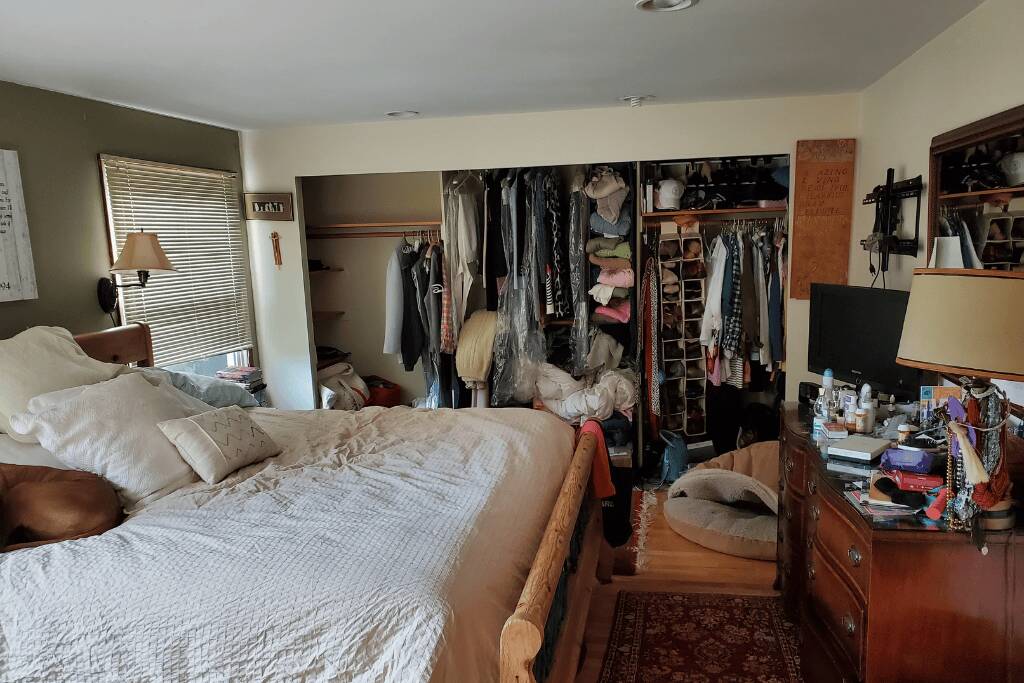
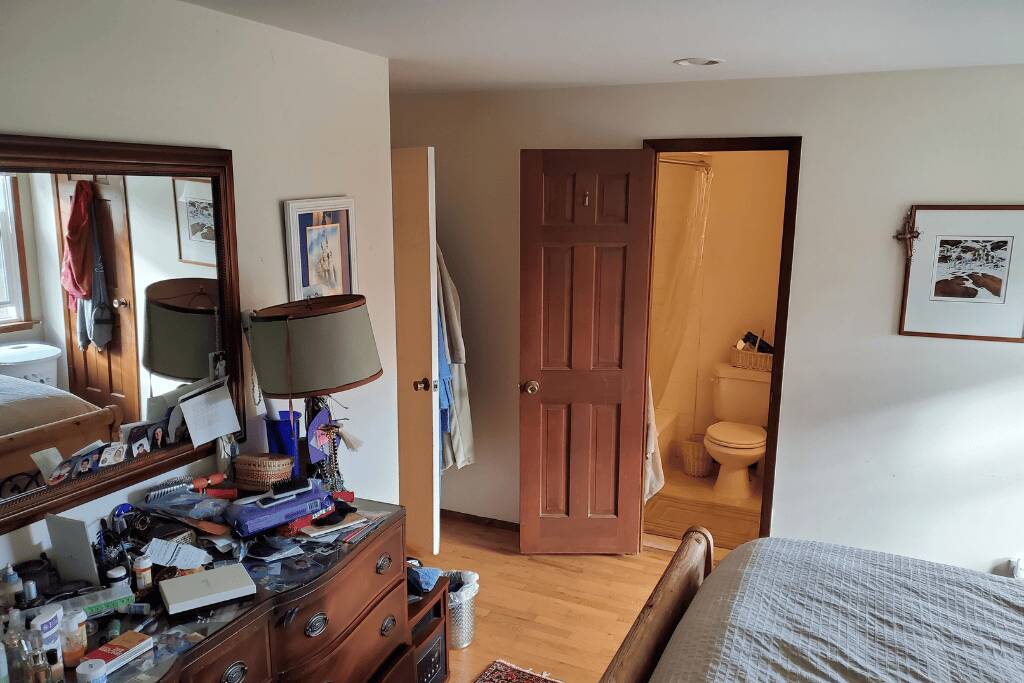
The primary bath remodel started with a bathroom that was cramped and tiny, providing no comfort or space for its users. The original layout had the entry door positioned in such a way that one would immediately walk into a tub and shower area, which was super cramped and not functional. The homeowners, who love their older home and its quirky characteristics, desire a larger, more elegant bathroom. They also want to incorporate natural materials and light into the redesign, while being mindful of their budget.
This is the second phase including “The Novel Solution”
Innovative Redesign
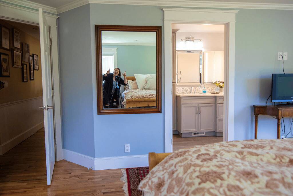
We completely redesigned the master closet and bathroom to create a more spacious and functional layout. We relocated the entry door and expanded the bathroom by adjusting the room’s angle and reconfiguring the closet. These strategic changes gave us more room to work with, allowing us to design a larger, more luxurious bathroom. We also added a new bay window, which created a charming seating nook and welcomed an abundance of natural light into the space.
Balancing Beauty and Budget
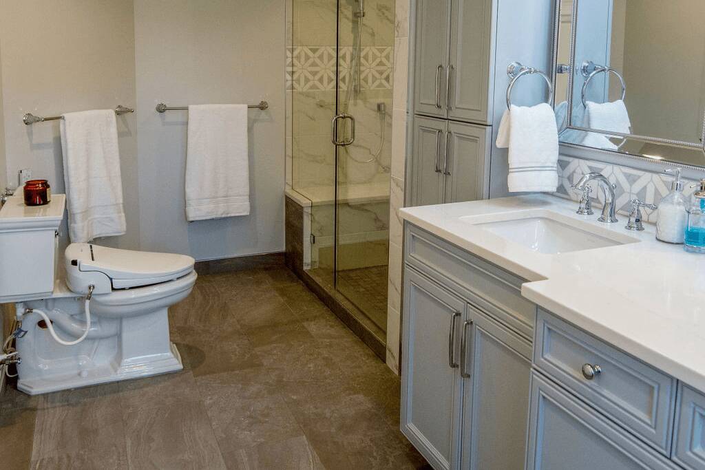
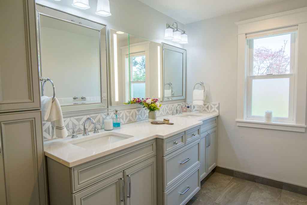
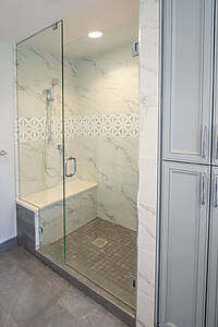
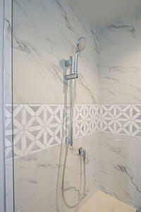
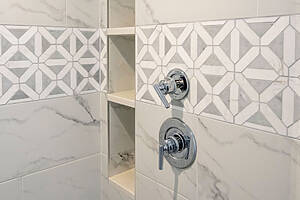
The homeowners envisioned a bathroom that felt brighter, more stylish, and significantly more spacious. At the same time, they remained firmly budget-conscious. To meet both goals, we got creative. We installed genuine marble tile for the backsplash and accent areas, while choosing high-quality porcelain tile that mimics marble for the shower. This smart blend delivered a luxurious aesthetic without exceeding the budget.
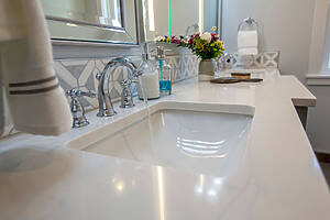
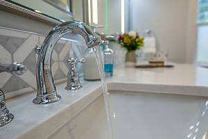
We selected durable quartz for the countertops, striking a perfect balance between elegance and cost-effectiveness. By combining beautiful yet practical materials, we achieved a harmonious design that offers both sophistication and everyday functionality.
Functional Enhancements
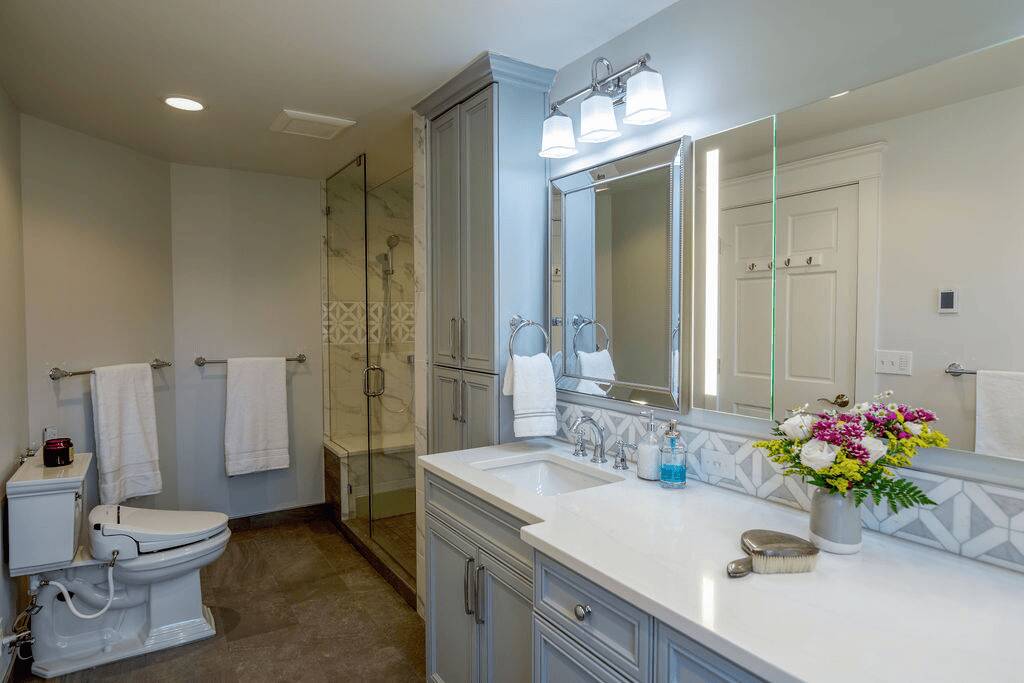
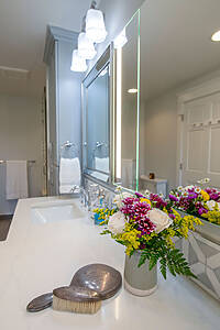
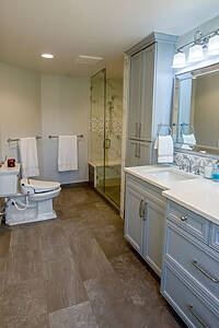
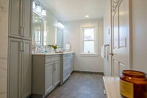
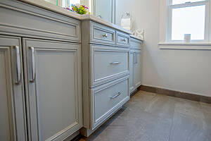
One of the primary goals was to add more functionality to the bathroom. Previously, the bathroom only had a single vanity sink, which was insufficient for the homeowners’ needs. We installed double vanities with ample storage space, ensuring that both homeowners had their own dedicated area.
The layout was carefully planned to accommodate their preferences. Although one of the initial designs placed the toilet in a separate water closet, the homeowners preferred to keep it in the main area. To maximize space and functionality, a bench was added to the shower, along with a large niche for storage, complete with quartz shelves for easy maintenance.
Design Details and Unique Features
The new bathroom features several unique design elements that enhance its overall appeal. The shower has a fixed head and a handheld showerhead, providing versatility and convenience. The bench in the shower extends slightly to create a decorative look, adding a touch of elegance to the space.
One of the standout features is the mirror setup. Instead of the typical individual recessed medicine cabinets for each sink, we installed a single recessed medicine cabinet in the center, flanked by surface mount mirrors on either side. This arrangement not only looks stylish but also provides ample storage and functionality.
The use of natural materials and light colors gives the bathroom a traditional yet fresh feel. The marble tiles, quartz countertops, and textured cabinets all contribute to the cohesive and elegant design. Despite its small size, the bathroom now feels spacious and luxurious, offering a much-improved experience for the homeowners.
The transformation of this tiny, cramped bathroom into a luxurious and functional sanctuary showcases the importance of thoughtful design and creative solutions. By reconfiguring the space and carefully selecting materials, we were able to create a beautiful, practical, and budget-friendly bathroom that the homeowners love. This project is a testament to the power of innovative design in transforming even the smallest of spaces.
Photography by: Jackie Phairow Photography





0 Comments