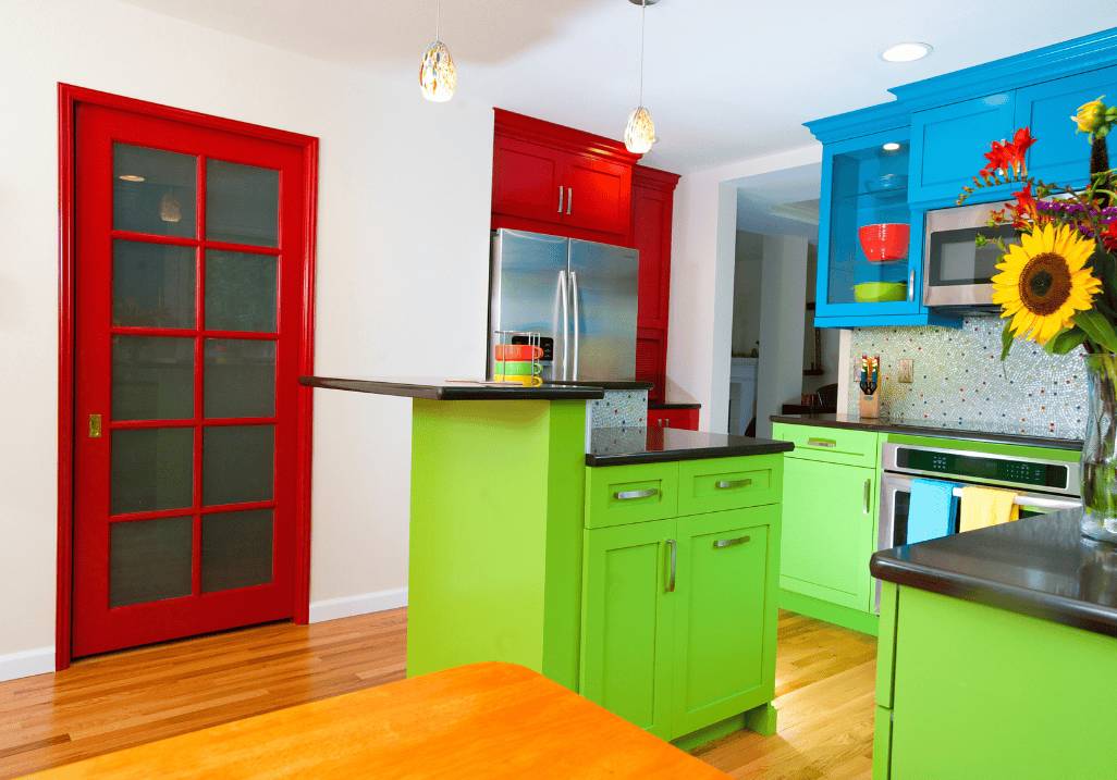
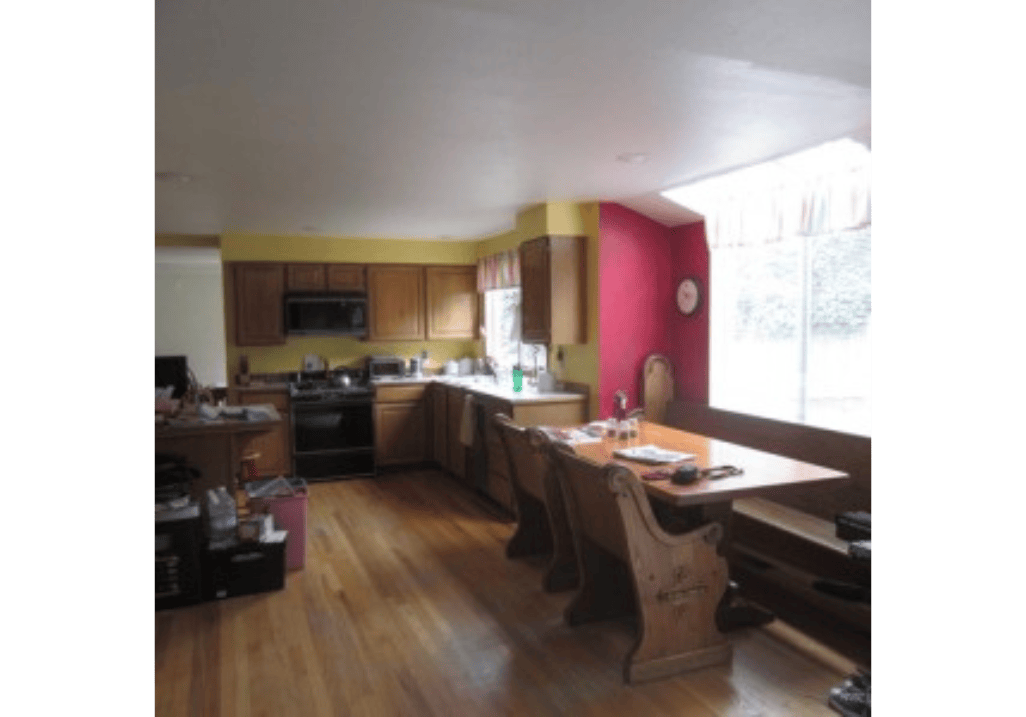
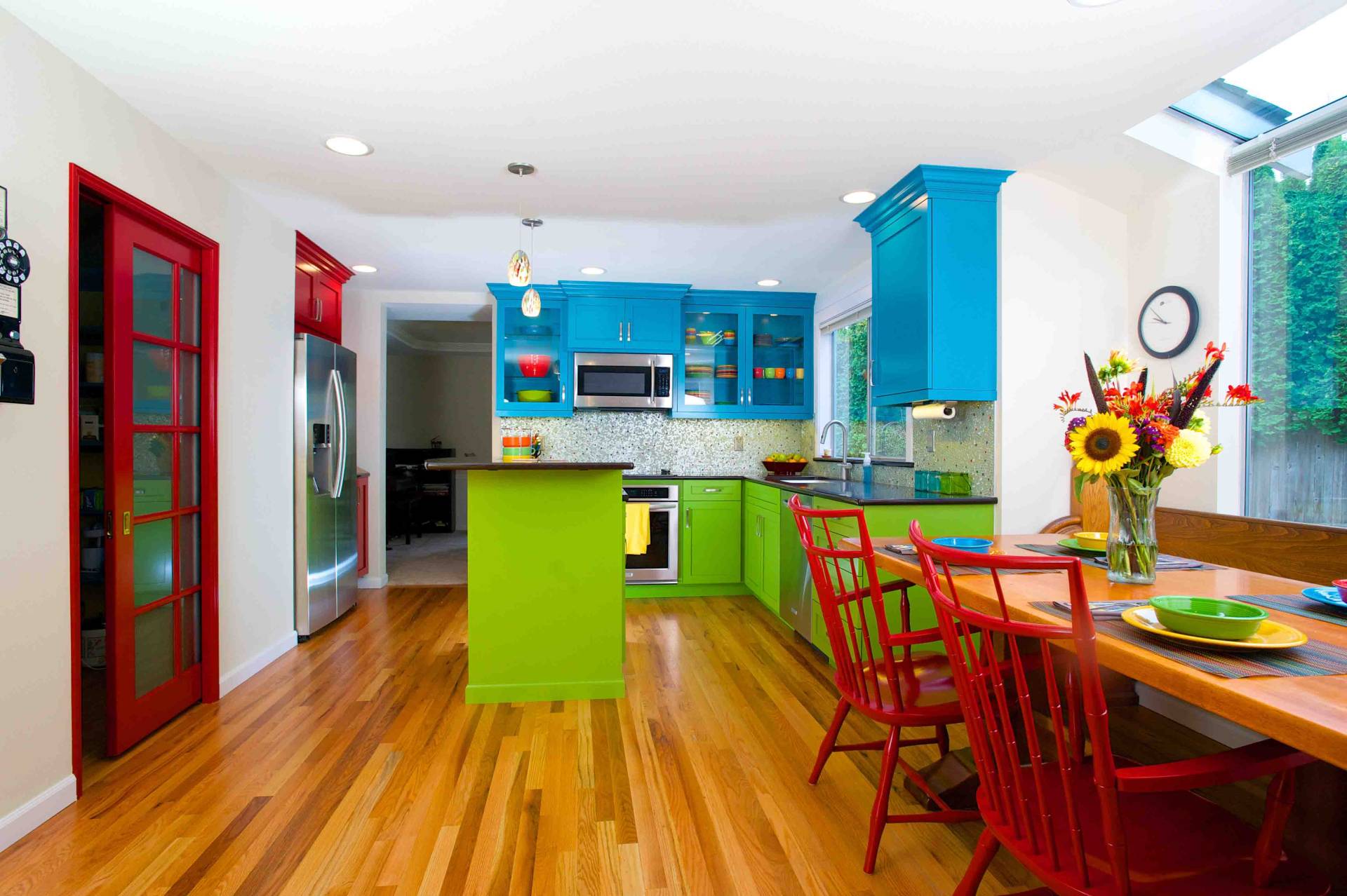
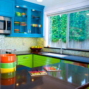
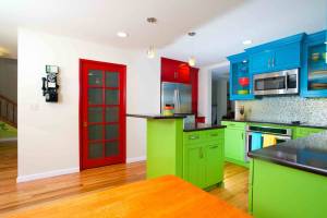
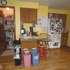
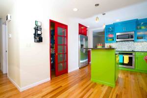
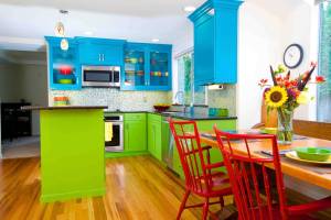
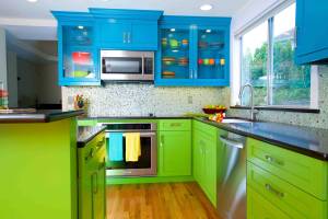
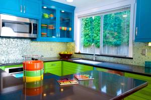
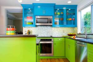
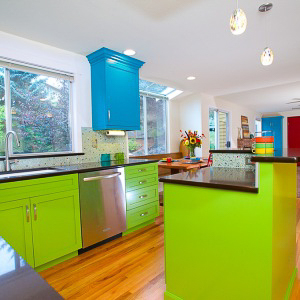
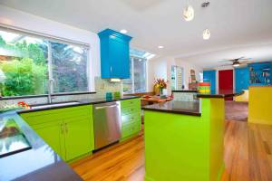
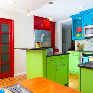
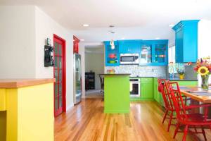
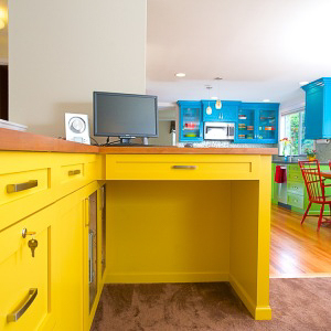
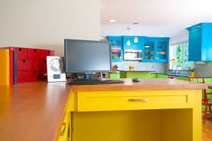
What’s considered “popular” is not always what’s best. In 2014, one of our repeat customers in Redmond contacted us to renovate their kitchen. The original oak cabinetry and challenging layout provided an excellent canvas from which to create their vision for a vibrantly functional space. Budget conscious finishes were designed and implemented to unveil what has become their favorite room in the house.
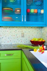
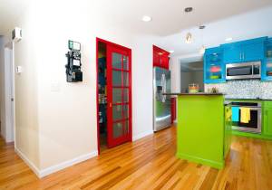
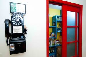
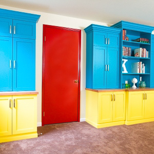
“Every time I enter my kitchen, I can’t help but smile” says Ellen Krumm, whose profession is rooted in behavioral psychology. The bold and bright primary color scheme is perfect for the family of four whose vibrant personalities are reflected in wall murals and splashes of color throughout the house. Inspiration and creativity were at the foundation of this particular design process. Even the pantry door was inspired by a British phone booth – and they would have gotten the real thing if only it were locally available.
The kitchen is the one room of the house where function can be more important than form. Ask anyone who has rushed through a kitchen renovation that turned out looking really good, but became frustrating to actually prepare meals in. This project won an industry award in its category for ‘Kitchens $55,000 to $75,000’ because often times the judges are looking for a wow factor, while meriting challenges, creativity, function and sustainability.
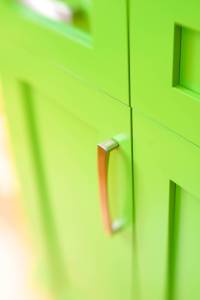
As housing evolves, the use of color provides a comforting environment that reflects individualism. Interior Designer, Ronda Webb says “80’s taupe is boring and has little to no connection to the soul. We encourage our customers to express themselves through color.” Paint technology has evolved to provide different versions of the same color formula through several types of sheen and durability compounds. The effects on various surfaces can be quite different in the same light.
When you walk into a room, most people can sense that something just doesn’t feel right about it. Is it the furnishings? The lighting? Perhaps a patterned carpet? What if the symmetry is off? It could also be the color – or more accurately, how the light is being reflected off that surface and perceived by your eye. Whether going bold or keeping it subtle, it takes someone with a designer’s eye to get it right.
To see the homeowners video of this project: The Bold & The Beautiful Trailer






0 Comments